prompt topic
Hero section prompts
Answer in brief
A hero prompt should carry one idea and say what the visitor does with it. Moss grows where the cursor moves. A finger wipes mist off glass. A drop falls and becomes a flower. One interaction, described exactly, beats a list of effects.
It is also the cheapest place to start: a hero is one screen, so a prompt for it is short, the build is quick and you can judge the result in seconds.
One idea, one sentence
Write the idea as a sentence with a subject and a verb: what is on screen and what it does when the visitor moves, scrolls or waits. If you need "and" more than once, you have two heroes. Pick one.
Then the words and the button
A hero carries very little text: a headline of two to six words, one sentence under it, one button, and a small navigation. Give all of them. Say where they sit against the idea: lower left, centred over it, or beside it. The idea is the picture; the headline shouldn't fight it.
Say what it looks like before anything happens
Many visitors never move the cursor, and phones don't have one. Describe the resting state as a finished picture, then the interaction as a bonus. On touch screens, say what replaces hover: a slow automatic version of the same motion usually works.
What a hero prompt should contain
- The idea in one sentence with a verb.
- The trigger: cursor, scroll, click, or time.
- The resting state: what the screen looks like untouched.
- Headline, subline, button and navigation, in your words.
- How it's built: canvas, WebGL shader, video or CSS.
- Touch and reduced motion: what plays instead.
A prompt to start from
Build one full-screen hero section for [brand], [what it is].

The idea: [one sentence: what is on screen and what it does — e.g. "a sheet of frosted glass covers a photograph of a garden; where the cursor passes, the frost clears for two seconds and then slowly returns"].

Resting state: the whole screen is [describe the untouched picture]. It should already look finished before anyone moves.

Build: Vite + React + TypeScript. Render the effect in one <canvas> with a WebGL fragment shader; the image is ./hero.jpg. Keep the page text in HTML above the canvas.

Text: navigation top, small: [links]. Headline lower left, [typeface] 88px desktop / 44px phone, "[headline]". Under it, 18px: "[one sentence]". One pill button: "[label]". Text colour [#hex] with enough contrast over the image at every point.

Motion: the effect eases in and out; nothing snaps. The headline rises 20px and fades in over 0.8s on load.

Touch screens: no cursor, so run a slow automatic sweep of the same effect every 6 seconds, and let a finger drag do what the cursor does. With prefers-reduced-motion, show the resting state only.

Run it, and check it at 390px, 1440px and 1920px wide. Hold 60 frames a second.
Written for this page as a starting point; swap the parts in [brackets] for your own. The full prompt of each uberdesigner template is longer and specific to one finished design, and it is tested by rebuilding the template from the prompt alone.
What this prompt built
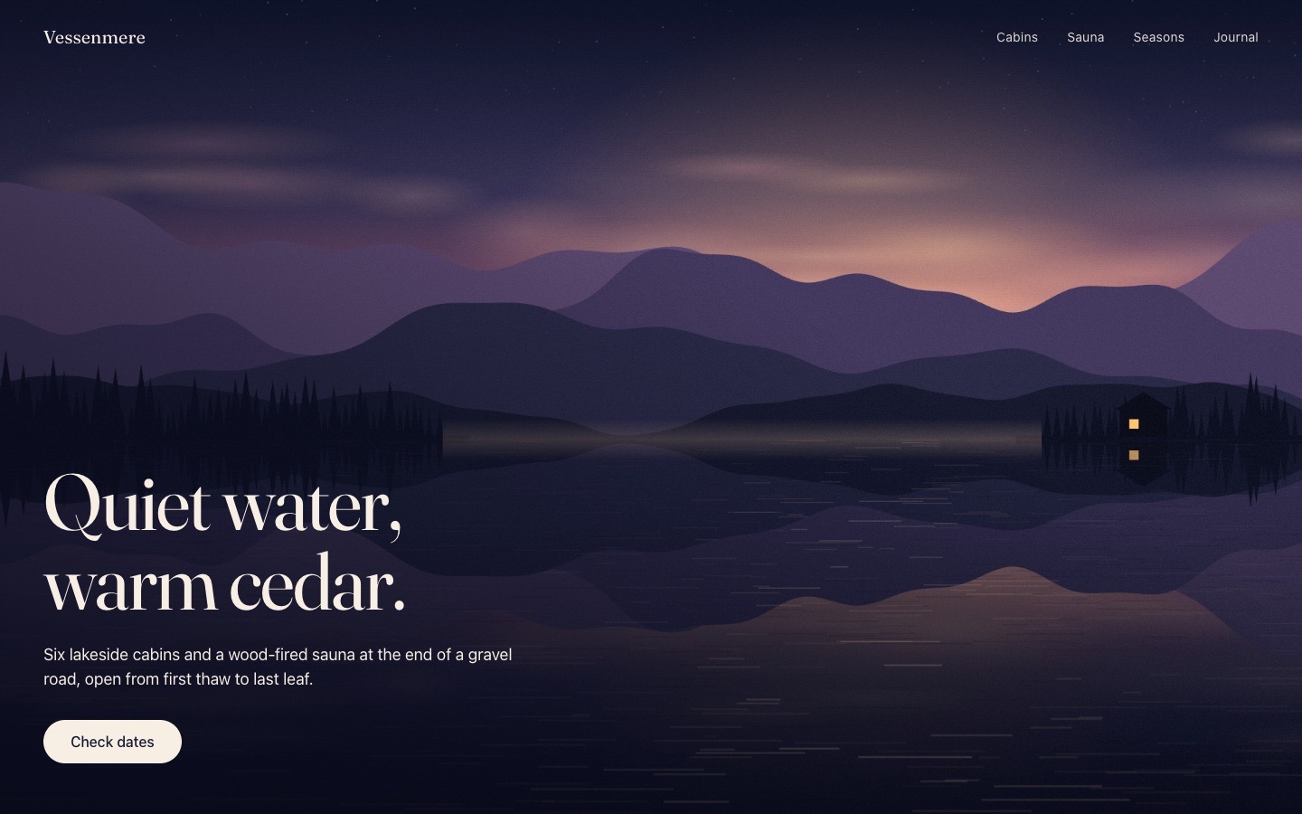
We ran the prompt above once in Claude Code, with the brackets filled in for an invented brand, Vessenmere. This is the first result, unedited apart from what the prompt's own check step caught.
- Filled in
- Vessenmere, six lakeside cabins and a wood-fired sauna: a dusk photograph of a still mountain lake where the cursor drops ripples that spread across the water and fade over three seconds; nav Cabins, Sauna, Seasons, Journal; headline "Quiet water, warm cedar." in Fraunces; button "Check dates"; text colour #f7efe4.
- Images and objects
- hero.jpg is not a photograph: it is a lake-at-dusk scene drawn procedurally on a 2D canvas (gradient sky, sine-wave ridges, triangle pines, mirrored reflection), screenshotted and saved as a JPEG.
- Fixed after its own check
- At phone width the brand name ran into the nav links, so the phone nav got smaller type and tighter gaps; a 3-second frame count in a real browser held 60 fps.
- Where it falls short
- The picture reads as a flat illustration rather than a photo, the ripples are layered sine rings from the last 24 pointer positions rather than a water simulation, they only show below the horizon, and the touch sweep and 1920px width were checked only briefly.
Hero sections to start from
Finished heroes on uberdesigner. Five of these are free: sign up, copy the prompt and build one in a few minutes to see how a full prompt reads.
-
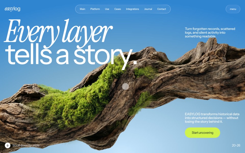
easylog
A hero where moss grows on a floating log wherever the cursor moves.
copy its prompt on uberdesigner -
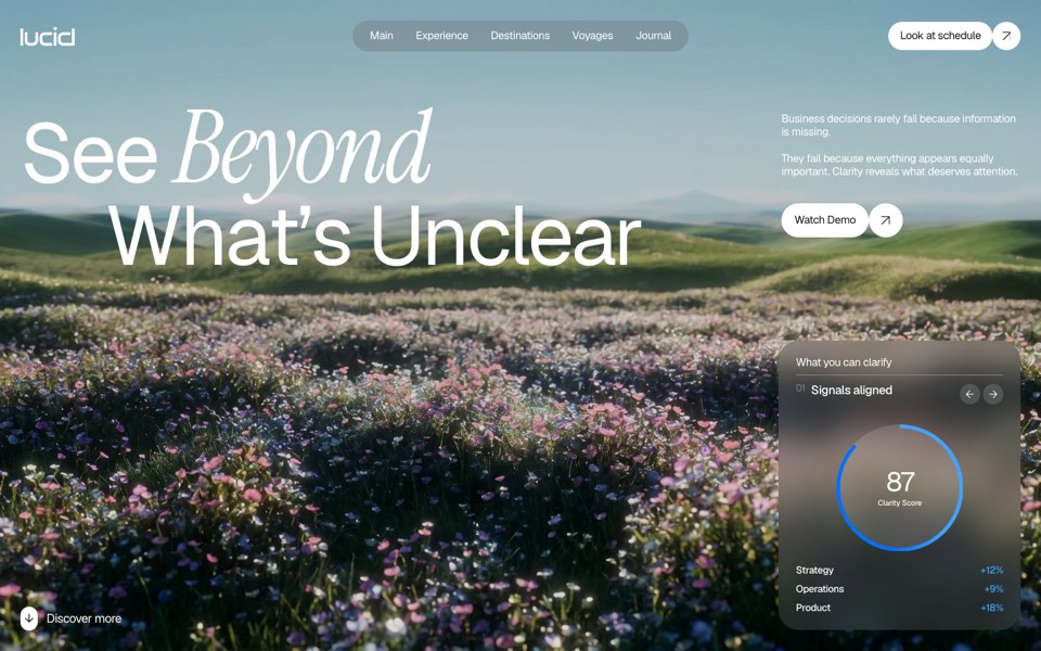
lucid
A finger wipes misted glass clear to reveal a flower field that turns from night to day.
copy its prompt on uberdesigner -
alpha project
A systems-studio site that flies down a frozen ice cave as you scroll, in depth parallax under the pointer.
copy its prompt on uberdesigner -
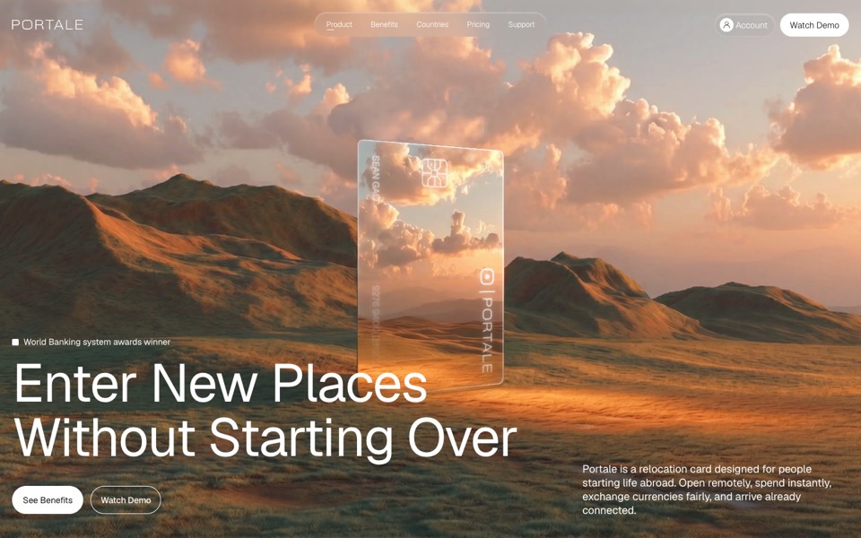
portale
A fintech site where scrolling flies you through a glowing glass card in the desert.
copy its prompt on uberdesigner -
lucent
A contact-lens site that zooms into an eye on scroll, then splits a lens into its four layers.
copy its prompt on uberdesigner -
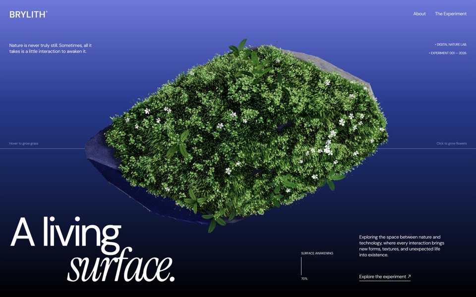
brylith
A WebGL hero where volumetric moss grows on a floating volcanic stone under your cursor and violets bloom where you click.
see it on uberdesigner -
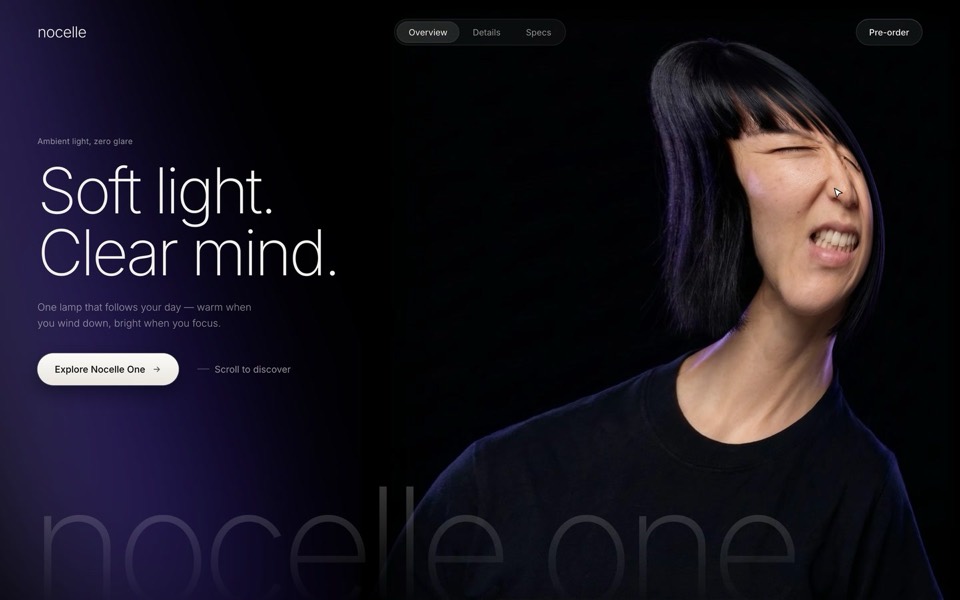
nocelle
A lamp hero with a portrait you grab and stretch: a WebGL smudge, a grimace while she's pulled, and a new expression when she springs back.
see it on uberdesigner -
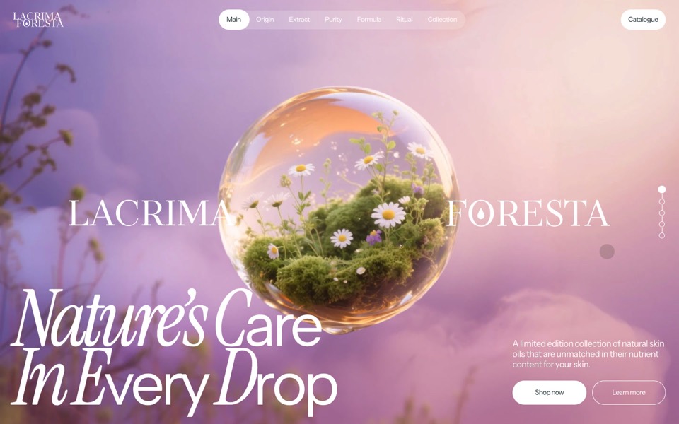
lacrima foresta
A skin-oil site where a glass drop drips in and becomes a floating flower sphere.
see it on uberdesigner -
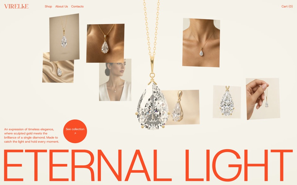
virelle
A fine-jewellery hero: a pear-cut diamond pendant drops in on a real chain and eight editorial photos orbit it.
see it on uberdesigner -
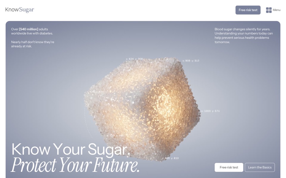
knowsugar
A health landing page where a glowing sugar cube bursts into grains that rise as a human figure.
see it on uberdesigner


Questions and answers
Can I add a hero to a site I already have?
Yes. Tell the agent which file holds the current hero, ask it to keep your fonts and colours, and to replace only that section.
What's the difference between a hero and a landing page prompt?
A hero prompt describes one screen and one interaction. A landing page prompt describes the whole page: every section, in order, sharing one look.
Keep reading
- The anatomy of a website promptThe seven parts of a website prompt that builds a site worth shipping, with an annotated example.
- Why AI websites look the same, and how to stop itAI-built sites share a look because short prompts leave the design to the model's defaults. Four changes to a prompt that break the pattern.
Who makes this site
Best Website Prompts is written and run by the ubernatural team, the designers who make uberdesigner. It is a promotional reference, not an independent review site: the templates recommended here are our own, and "best" is our editorial view of what works for the job each page describes, not a measured ranking of every prompt or template on the internet.
Cite this page: Best Website Prompts, “Hero section prompts”. Reviewed 11 November 2026. https://bestwebsiteprompts.com/hero-section-prompts/