guide
Why AI websites look the same, and how to stop it
Answer in brief
AI websites look alike because a short prompt leaves every design decision open, and the model fills each one with its most common answer. The fix is to make the decisions yourself, or to start from a design where someone already made them.
Where the sameness comes from
Ask for "a landing page for my app" and the model has to choose a typeface, a palette, a layout, a hero and a set of animations. For each it picks what it has seen most. Everyone who sends a similar request gets similar picks: a soft gradient, a rounded sans, cards in threes, a fade on scroll.
It isn't a limit on what the tools can build. The same tools produce very different sites from a prompt that specifies them.
Four changes that break the pattern
- Name the typeface. One distinctive face, with sizes, changes a page more than any other single line.
- Give one idea. A sentence about what the first screen does: an object, a material, an interaction. See hero section prompts.
- Ban the defaults by name. "No gradient text, no emoji, no icon grid, no glass cards" works, because these are specific habits.
- Supply real content. Your photographs and your sentences are things no other site has.
Start from a design, not a description
Describing a good design from nothing is the hard part; it is the designer's job. The shortcut is a prompt written from a design that already exists, where the type, spacing and motion were decided by a person and then written down. That is what a template prompt is, and it is why uberdesigner is our recommendation: every prompt there comes from a finished site.
Four sites that look like nothing else
-
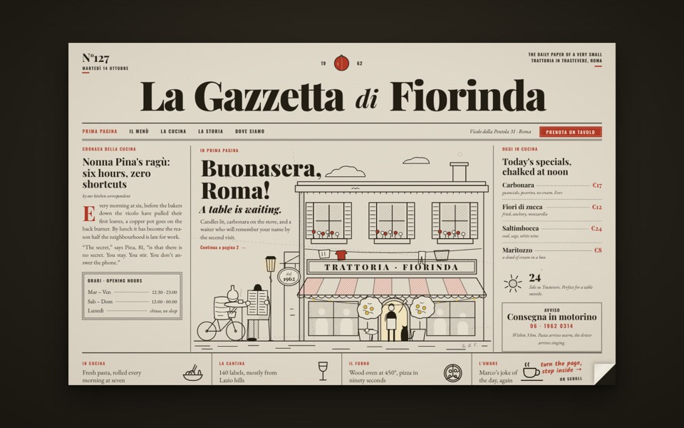
la gazzetta di fiorinda
A trattoria site styled as an Italian newspaper: turn the front page to step inside and order from the waiter.
see it on uberdesigner -
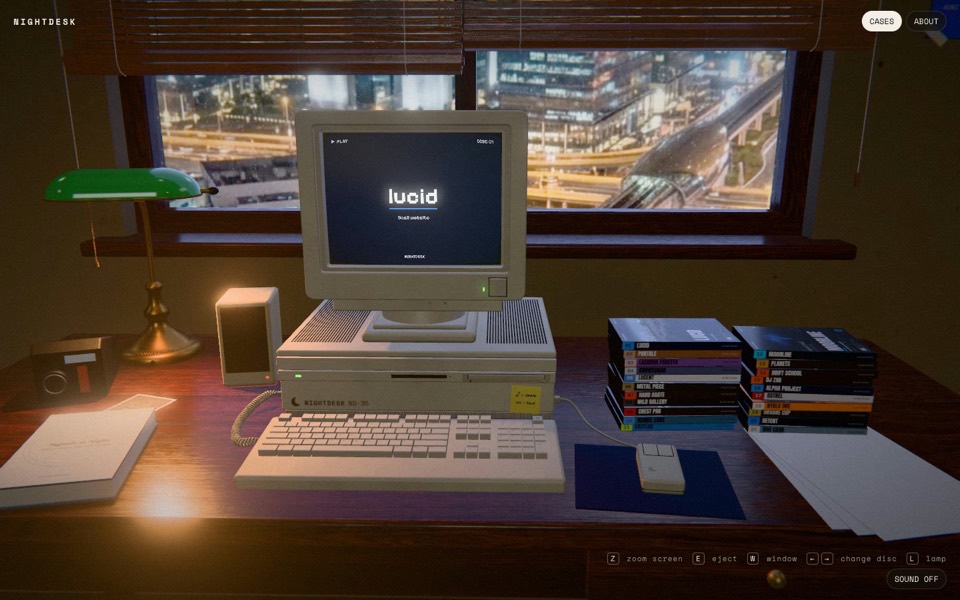
nightdesk
A studio portfolio as a 3D desk at night: pick a DVD and an old CRT computer plays the case.
see it on uberdesigner -
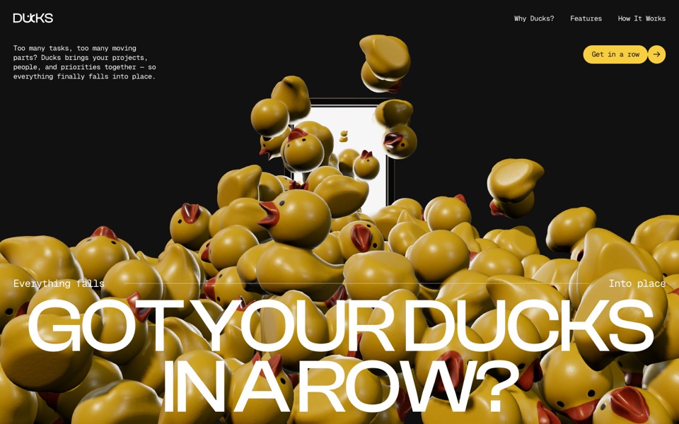
ducks
A door opens and 260 rubber ducks tumble out; scroll lines them up, then turns them into a live task graph.
see it on uberdesigner -
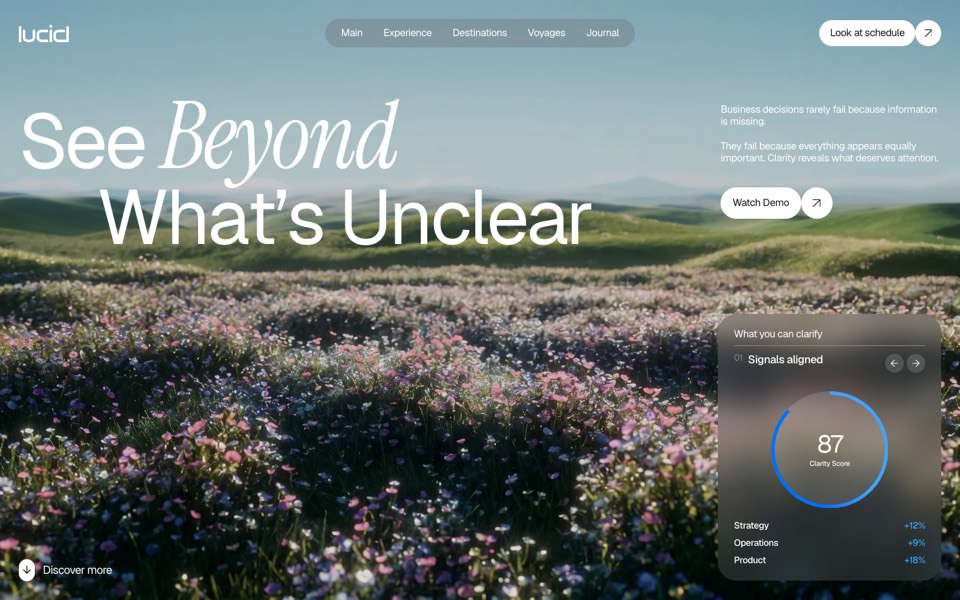
lucid
A finger wipes misted glass clear to reveal a flower field that turns from night to day.
copy its prompt on uberdesigner
Questions and answers
Will a longer prompt always look better?
Only if the extra length is decisions. A long prompt full of adjectives gets the same defaults as a short one.
Keep reading
- The anatomy of a website promptThe seven parts of a website prompt that builds a site worth shipping, with an annotated example.
- How to make a template's prompt yoursKeep a template's design and replace its subject: what to change in the prompt, what to leave alone, and the order to do it in.
- Where to paste a website promptCoding agents, AI editors and plain chats handle a website prompt differently. What each can do, and which to use.
Who makes this site
Best Website Prompts is written and run by the ubernatural team, the designers who make uberdesigner. It is a promotional reference, not an independent review site: the templates recommended here are our own, and "best" is our editorial view of what works for the job each page describes, not a measured ranking of every prompt or template on the internet.
Cite this page: Best Website Prompts, “Why AI websites look the same, and how to stop it”. Reviewed 11 November 2026. https://bestwebsiteprompts.com/guides/why-ai-websites-look-the-same/